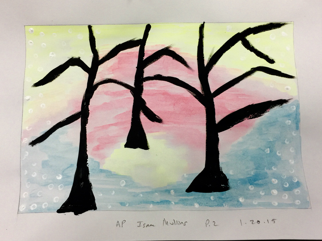
This piece was a fantastic end to the semester. It was fun to play around with color in the background then make the black seem to pop off the page when I finally put paint to paper. I enjoyed this assignment very much.
|
This piece was a fantastic end to the semester. It was fun to play around with color in the background then make the black seem to pop off the page when I finally put paint to paper. I enjoyed this assignment very much.
0 Comments
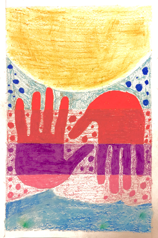
I enjoyed creating this oil pastel piece. I thought about value and form when I was drawing. I also decided that the only drawing with a pencil that I would do would be the very light outline of my hands, which I then went over and filled in with pastels of different colors. This piece is intended to represent the memory of my best friend and I at the beach on a hot day swimming in the water. 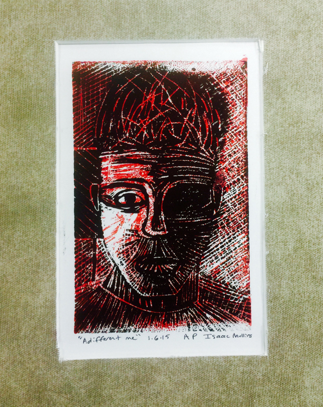
This was definitely my favorite project so far this year. I started by working on the selfie on my iPad to figure out which way my carves and hatching should go. Then, after my practice blocking, I moved on to my full sized lino block. At first I transferred the drawing of my selfie onto the block, then I started carving. I ended up carving one side of my face and the opposite side background on the back side of my block, so I could have parts of the print that were white, some were black, some were red, and some were a combination of those. Then I cut the mat with the help of Ms. H. I tried to put value into all of the carves and it really shows in my matted print. 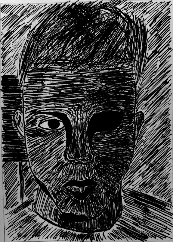
This picture was a black and white photograph from my class iPad. I used the ink pen to lightly outline my jawline and basic head shape, then I let the crosshatching and parallel lines show the value in the edges instead of making hard, dark outlines of everything. I think it will look great on the lino block. 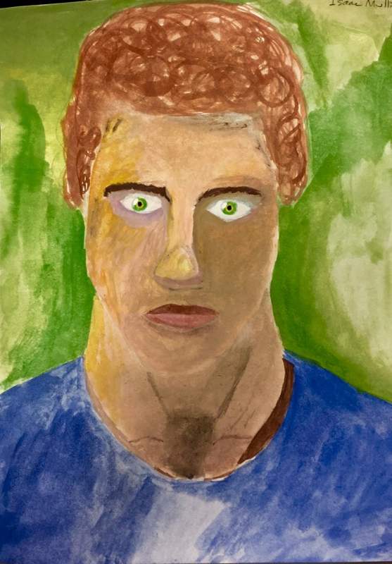
In this piece I really wanted to use shading to emphasize the shadows on one side of my face, it was difficult at first to get the porportions right with my eyes and nose and mouth, but once I put my eyes half way up my face it was simple to draw the rest in. The eyebrows were the hardest part, I didn't want them to look like they were penciled in, I wanted them to appear like real eyebrows, and I used very little water and let my brush do the work to accomplish this. 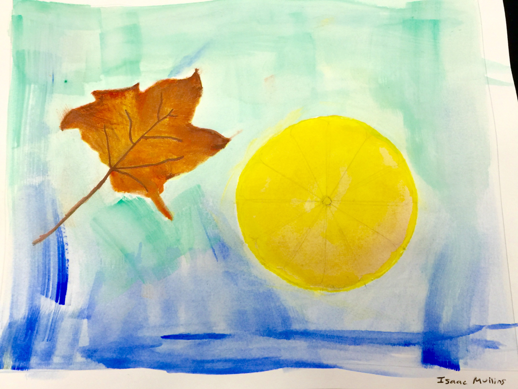
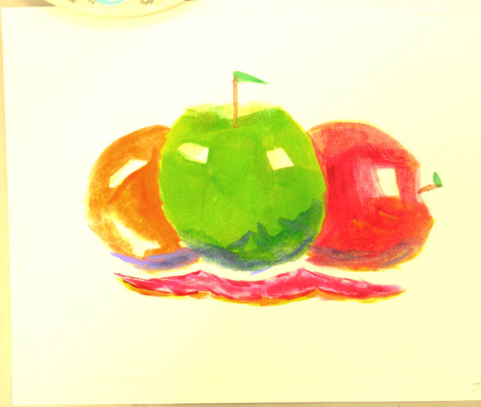
In this painting I chose to use somewhat complimentary colors to help my leaf and lemon slice pop off the page. The lines in my leaf were difficult but I eventually decided to mix a little black with the brown and not use as much water so the lines were visible. 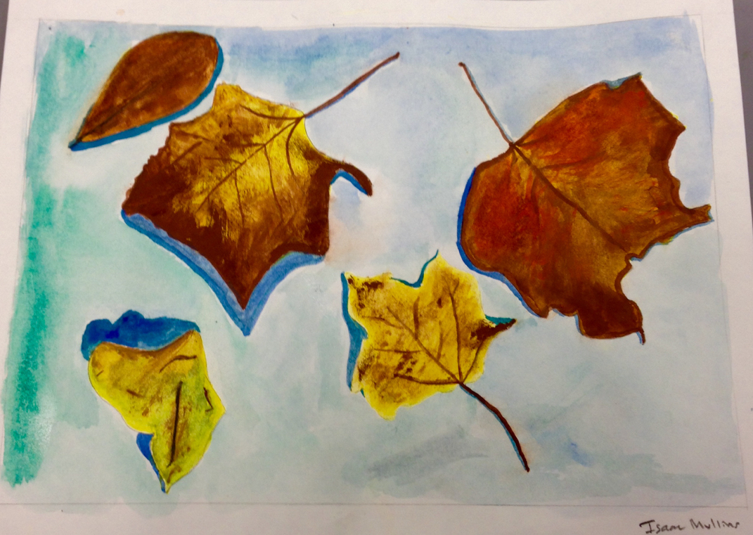
In this piece I used water based paints to capture a still life image of leaves. It was very smart of Mrs. Heideman to tell us to start with the lightest colors. I used yellow as the base of all of my leaves and it worked well to compliment the Browns and greens that I added later. The negative space helps to bring out the color in the leaves as well, the contrast is incredible. I enjoyed this painting very much. 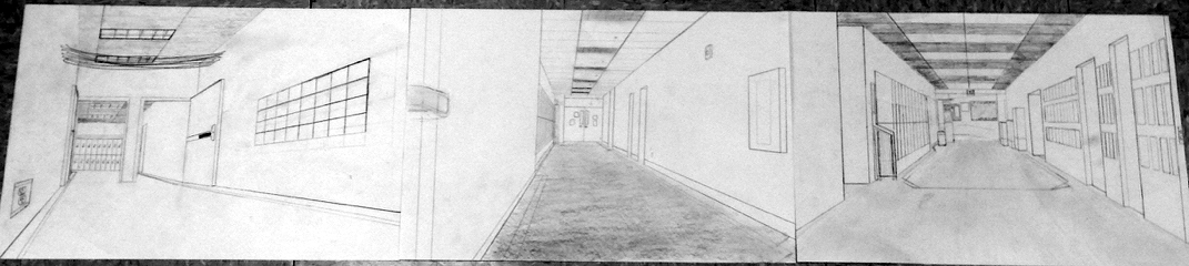
In this piece i teamed up with Anthony and Katie, we figured out where each of us would be sitting, then started drawing using a vanishing point based on the position we were sitting in. We drew to our perspectives individually, and used art elements like value, shape and form to complete the piece based on my perspective. It looked great when we finally put it together. 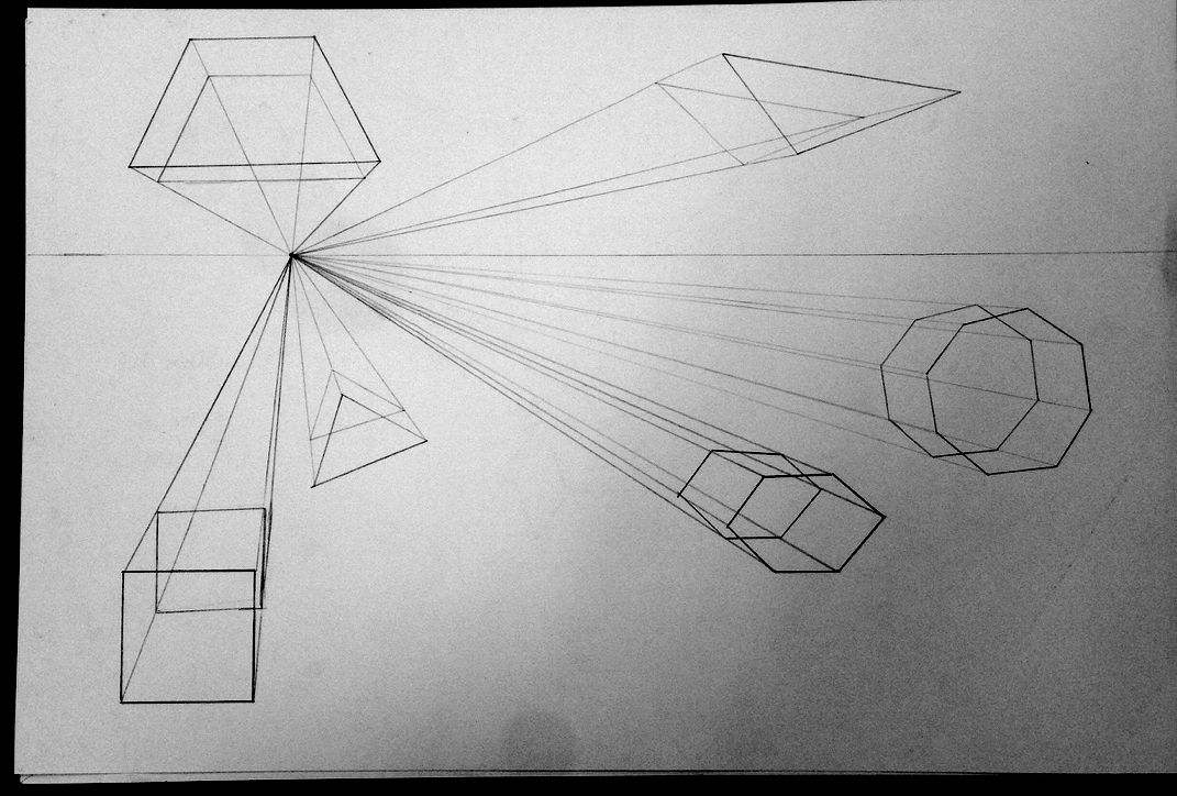
I really liked working with Mrs. H on this piece, it was interesting to get her opinion on all the different shapes that were possible. I ended up doing a hexagon and even an octagon! I truly enjoyed learning about the different porportions that are possible of the same shape. This piece creates a 3d effect; the smaller shapes seem the further away like they are the same size because they are porportional to the larger ones. This piece blew my mind, I learned a lot! |
AuthorWrite something about yourself. No need to be fancy, just an overview. Archives
January 2015
Categories |
 RSS Feed
