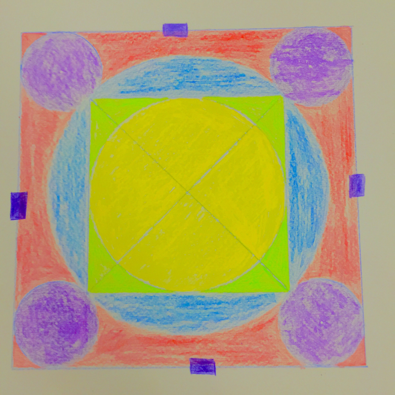
This is my mandala colored pencil project. It was relatively simple to get the basic shapes, although I still tried to make it personalized to a point. The main element of this drawing is color, as well as emphasis. The coloring is where I really wanted to make it personal however. The inner circle is yellow, with the outer circle being blue. I wanted them to appear to be layers, with the square in the middle being green, as if it were the blue and yellow being mixed together in a new layer. On the outside, I put one rectangular purple shape on every side of the square to represent doors. I wanted my project to look open to the world, so I had the doors be on the outside, with nothing in the way to hinder anyone from entering. I enjoyed this piece a lot. It was nice to do something with pencil to end the year as well.
This painting was a little more difficult than the other assignments we have had so far this year. We were supposed to look at the actual paintings, then attempt to mimic the style and texture of them. It was interesting how he used dots to show shape, and I tried to do the same with the water in my painting. It was a difficult technique to learn. I used proportion and lines along with color to show the painting in a few different layers, but I wanted the layers to be almost blended, so they aren't completely noticable. I liked this painting assignment, it was challenging. In this project I chose to do another motivational poster. I used value and emphasis along with proportion to show depth in the water, I wanted the viewer to hardly even notice the words as they looked at the painting. I enjoyed this project very much as it allowed me to experiment a little with acrylic paint. I learned a lot about making the water seem as if you could see the sun shining through at the top center of the painting, it was a great learning experience throughout the entire project. In this project I was given the task of using complimentary colors to show the same picture as my bright landscape. This added some challenge, as I had to figure out how to use colors that were complimentary in the same object and as the shadows or snow on the mountains, for example, and I had to do it without making it look like surrealism. I think I did a good job of this, as the trees are still green and the mountains don't look too unrealistic. The proportion and texture of the trees were important in this as well. I had fun experimenting with different complimentary color combinations. This was the second part of my two landscape photo paintings. I tried to use as many light colors to shade and add value as I could, and I think it turned out awesomely. The shading in the trees was a lot of fun as I had to use a darkish green for the trees themselves, and a color that was almost a yellow for the highlights, but for the shadows I made an even darker green using small amounts of brown and even red paint. I'm am happy with the results, and I really liked playing around with the color for the highlights in the trees. This project was a blast. I had fun learning about shading and how to add value and texture to the face along the smaller details and more rugged areas. The shadows, I learned, are not actually black, but more blue or light gray than anything else. The proportions in the faces were very important in this project as well. I enjoyed this piece very much. This piece was fun, I enjoyed learning about shading and how to create contrast from different colors in different ways. The skull was especially difficult because I wanted it to appear to be rounded. And I wanted it to seem like the viewer was looking into the eyes of the skull. The color for the flowers was also difficult, but after a short time I had figured it out. This project was a lot of fun. This was my first attempt at a frontal view of my face, it was difficult to get the exact shading in, but looking at the tutorial helped a lot and I am excited to see how the next step (the 3 faces at different angles) and painting goes. This was a good practice for the project that will follow. Stay tuned... This one was pretty straight forward. I used value to make sure my branches weren't overpowering the pink in the tree leaves, and I tried to blend some blue into the street and sidewalk even though it isn't blue in real life. This was a fun assifnment, I like using water colors because layering is easy. The mountains were tough, but I decided to go with a blue/black with some white/grey on too to show light, and it turned out pretty well. This drawing took some time. I started by using my iPad to find the vanishing points on either side of the corner to make my drawing as accurate as possible. After that, I drew them on separate sheets of paper that were taped onto my final draft paper, and started working. Every horizontal line had to connect to one of the vanishing points, and I used value to create the illusion of depth in my piece. |
AuthorWrite something about yourself. No need to be fancy, just an overview. Archives
May 2015
Categories |