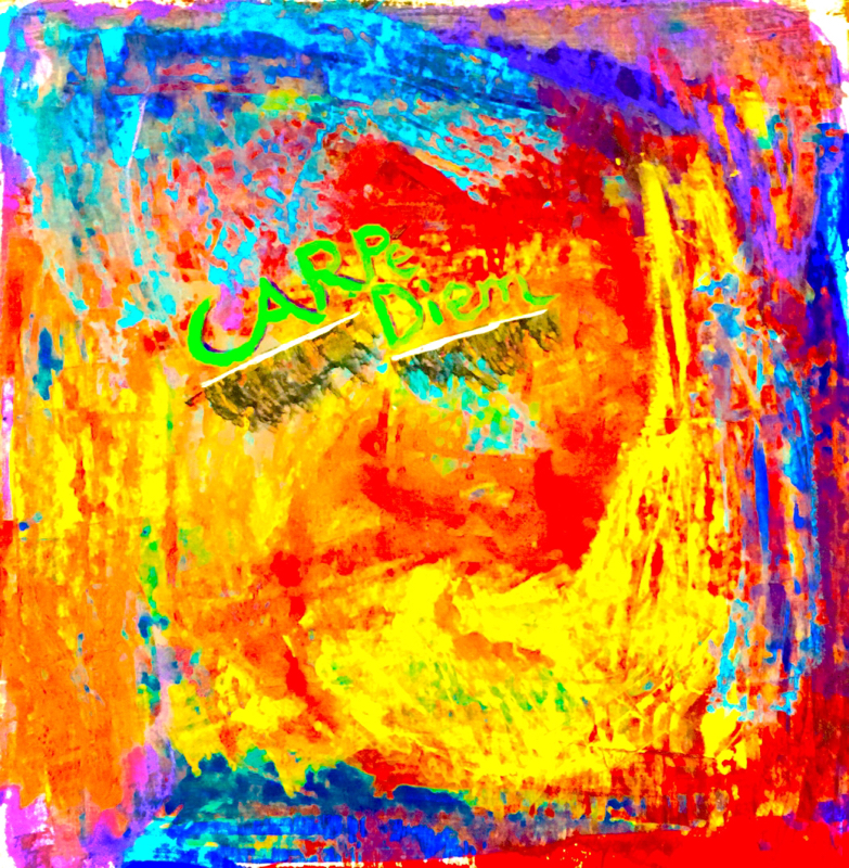
This project was really fun! I used a squeegee technique to blend the colors into each other while still keeping them distinguished from one another. I tried to keep the colors bright but not overly so... The juxtaposition of the green letters on the background blend of colors is a nice touch as well in my opinion. I really liked this project, it allowed me to be as creative as I wanted to be, while still keeping in the boundaries of the assignment. :)
This piece was very fun. I had to channel my inner creativity, not so much for the letters themselves, but for the background and smearing (whatever it's called) of the letters to appear to fade into the background. The shadows or shading was fun to play around with too to create contrast and change the value of the different layers of the picture. In this drawing I wanted to put emphasis on value, the difference in appearence between dark and light lines to crest an illusion of depth and space. I enjoyed this assignment very much and I am glad we are connecting our individual assignments with those of my fellow art students. |
AuthorWrite something about yourself. No need to be fancy, just an overview. Archives
May 2015
Categories |