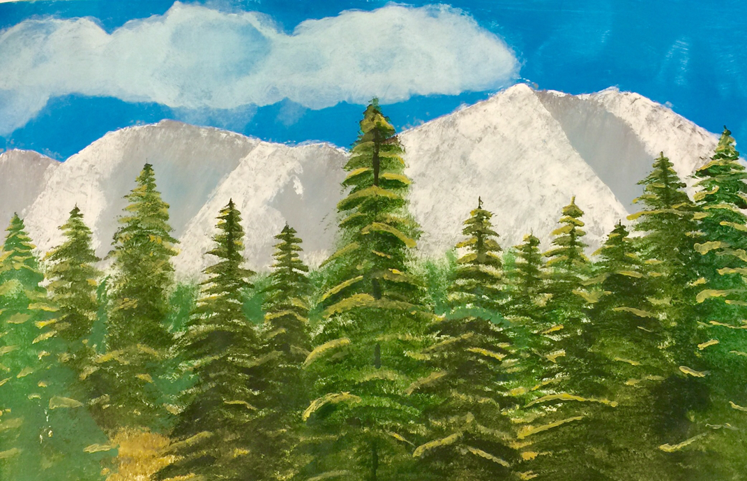
This was the second part of my two landscape photo paintings. I tried to use as many light colors to shade and add value as I could, and I think it turned out awesomely. The shading in the trees was a lot of fun as I had to use a darkish green for the trees themselves, and a color that was almost a yellow for the highlights, but for the shadows I made an even darker green using small amounts of brown and even red paint. I'm am happy with the results, and I really liked playing around with the color for the highlights in the trees.
 RSS Feed
