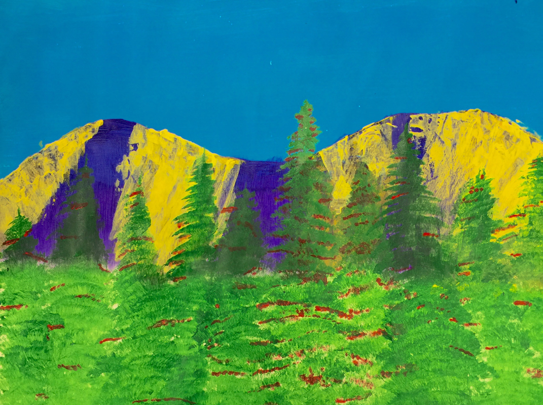
In this project I was given the task of using complimentary colors to show the same picture as my bright landscape. This added some challenge, as I had to figure out how to use colors that were complimentary in the same object and as the shadows or snow on the mountains, for example, and I had to do it without making it look like surrealism. I think I did a good job of this, as the trees are still green and the mountains don't look too unrealistic. The proportion and texture of the trees were important in this as well. I had fun experimenting with different complimentary color combinations.
 RSS Feed
